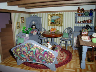
I've continued to add details to Orchid Cottage this week. Some of the furniture has moved about or simply been added or removed and I think I've finally gotten it right. Probably.
The floral throw across the foot of the bed was all wrong so I've replaced it with some velveteen in purple and wine with a little lace trim and I like the bed much better because of it. I've added a storage chest at the foot of the bed and added some faux cupboard doors which access some imaginary storage under the eaves of the roof.
I've dressed up the top of the chest of drawers with some typical dressing table items.
Downstairs, the sofa is now at the front of the room and the dining table at the back. This looks more pleasing than having the two tables right at the front but makes it hard for the resident to sit and gaze out the front window. The back of the sofa was quite bland so I added interest with a panel of fabric and recovered the rest of the sofa in the same fabric.
On the back wall the wrinkled wallpaper has been covered up with this large framed picture. The table holds a floral arrangement but still needs a little something more - perhaps a lacy doily under the flowers. I don't want to totally cover up the wooden top, but at the moment it's a little too bare.
The ToM Bathroom now has all the features that are part of the plan for the room but it's still lacking something. I tried sitting the partly made canopy back in place, but that still looks wrong. Perhaps a canopy with thinner, more delicate supporting posts or perhaps some sort of large chandelier hung overhead. Overall, I think it's time to give up adding rooms to the ToM, they rarely co-operate and it's just as rare if I actually whole heartedly like the end result.


The Orchid looks great. I really like the new furniture arrangements. I think the House of Magic bathroom just needs a large, elaborate chandelier over the tub and it will be perfect. I always look forward to your blog posts - I love your creativity!
ReplyDelete